How Do I Use Pop-Up Windows?
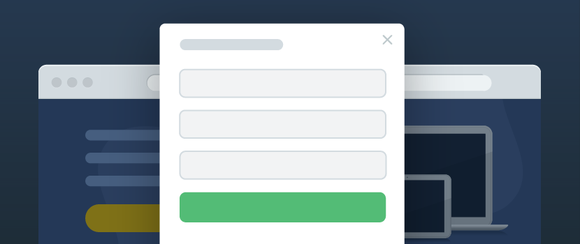
Some users mistakenly consider a pop-up window to be an intrusive ad but this is not always the case. A pop-up can be effectively used:
- to notify of special offers;
- to offer a subscription to the company’s news;
- to offer a callback option at the preferred time.
A properly configured pop-up is sure to increase website conversion rates, bring new clients and even wake up your old ones.
Features of uKit Pop-up Windows
You can find information on how to create a pop-up in uKit in our Knowledge Base. In this article, we would like to focus on how you can use pop-ups and which configuration options are available in the Builder.
1. Pop-up as a timer
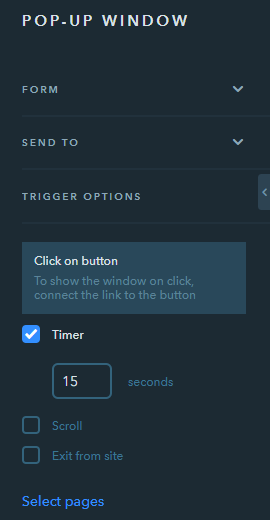
In pop-up configurations of uKit, you can find a very useful and convenient tool — Timer.
Use Google Analytics to see the average time each visitor of your website spends before leaving it. Set the timer to that point, and place a feedback form in the pop-up window to notify your clients that they can get expert advice from your company for free.
You have nothing to lose — statistics show that the visitor was just about to leave the site but such a reminder can substantially increase the number of potential clients you can reach. The only thing you should do next is to convert them into the real ones.
2. Help window that pops up when scrolling the page
This is another way of client retention. If your page is big and informative enough which leads to endless scrolling, try to configure a pop-up to display while scrolling down the page. No worries, the pop-up won’t appear too fast and won’t distract the visitor from perceiving the information of the website — the visitor will be able to see it only after viewing 75% of the page.
The fact that the visitor has browsed ¾ of the whole page means that they are interested in your product or service and are most likely to buy or use it. All you need is to prompt the visitor to contact you.
3. Help window that pops up when closing the page
If the cursor is outside the work area (for example, the visitor wants to point at the close icon of the tab), at the last moment they will see the pop-up window. This pop-up usage option is the least effective in terms of website conversion increase. However, in some cases, it can work.
Tip:
It’s better to configure a pop-up for a while to see the visitors’ reaction. If you notice that clients react negatively to the pop-up format, disable it. The negative reaction means the percentage of people who visited the site is too low or equals zero. The thing is that a pop-up may scare the clients off from going back to the site, even though, theoretically, they were about to return later.
4. Classic help window that pops up when clicking on a button
Don’t hesitate to add buttons with some tips to your website. This is the least annoying format for visitors: if you don’t want to see some information, simply don’t press the button. Still, such a pop-up format, in general, is quite effective for one-page websites (landing page).
Tip:
Experiment with button texts to increase the percentage of clicks.


