Blocks Settings

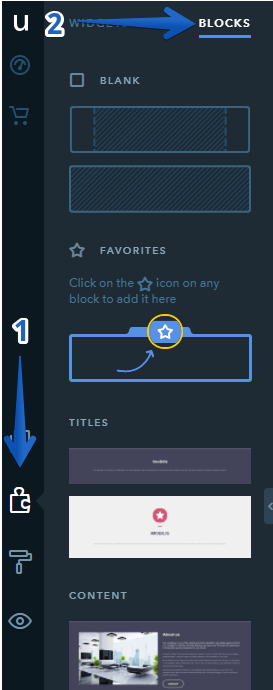
A website page is structurally made up of blocks. A block is a unit consisting of pre-set widgets. You can find ready-made blocks in the Builder under the Blocks tab:
Each block has the following settings:

- Set up the block’s background
- Set up the block’s structure
- Duplicate this block to the current page
- Copy this block to another page
- Multi-page block settings
- Add this block to favorites and show it in the Blocks tab
- Pinned block settings
- Hide blocks on desktop
- Set up an anchor link for a block
- Delete this block
Note:
Whichever of the 3 ways you choose to copy the block with the Product widget, it won't feature the custom products you added before. Instead of your items, you will see a standard uKit product — the wooden chair. This is because each product has it own ID, which is important for the correct work of the widget.
Block Background Settings
Here are the options you can enable for a block background:
The colors available for a block background depend on the selected template and color scheme. You can change the color scheme and template under the Design tab of the Builder.
In case you set an image as the background of a block, it has the following settings:
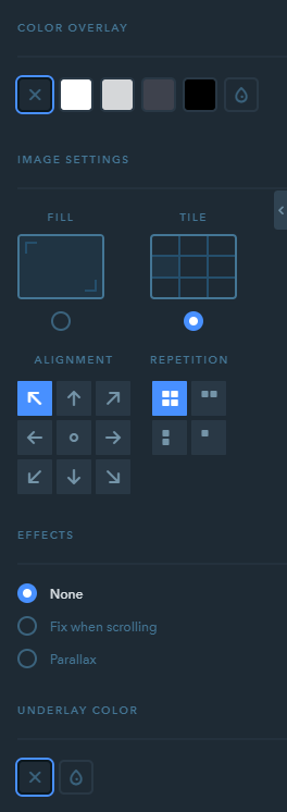
- Color overlay — this setting will allow you to add a color layer over your image. It can be helpful if you need to use a white font in a light-colored image.
- Image settings — these settings define how the image will be used in the background: the image can be stretched to the width of the screen or repeated across the screen like tile, you can also set up the image alignment and repetition, the latter being available for the tile option.
- Effects — you can fix the image in the background (so that it does not change its position when scrolling), or create a parallax effect.
- Underlay color — this color will be displayed until the image is fully loaded, and also if you use a transparent image (this color will be under the picture you selected).
The settings of the map block are similar to those of the Map widget, except that here you can also add a layer of color over it.

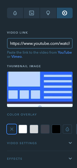
If you want a video to play in the block background, select the Video option and paste a link to a video from YouTube or Vimeo.
Note:
Make sure you have allowed the video to be embedded on the third-party services in the video settings on side of the video hosting.
The settings of the video background allow you to:
- change the thumbnail image
- set up color overlay and adjust its transparency
- center or right/left align the video
- set the zoom
- set the speed of video playback
- add visual effects
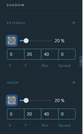
You can add outer and inner shadows. You can set multiple shadow effects for each side of the frame. The shadow options are as follows:
- Opacity — specifies the opacity/transparency of the block.
- The X-offset — the horizontal offset of the shadow, a positive means the box-shadow will be on the right of the box, a negative offset will put the shadow on the left of the box.
- The Y-offset — the vertical offset of the shadow, a negative one means the box-shadow will be above the box, a positive one means the shadow will be below the box.
- Blur — sets the shadow blur radius.
- Spread — sets the shadow spread radius.
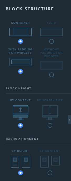
Block Structure
You can configure the following settings for the block structure:
- Container or Fluid — this choice will set the width of the block where widgets are placed. The Fluid option stretches widgets for the entire width of a website, while the Container option sets the width of the block to 1200 pixels.
- With / without padding for widgets — if you choose to use widgets with padding, small spaces will be added all around the widgets of this block. This way, the borders of the widgets that are placed next to each other will not touch.
- Block height — if you select By content, the block size will depend on the height of all the widgets in the block. If you select By screen size, the block height will depend on the screen the website page is viewed on.
- Scroll down button — if you activate this feature, it adds a clickable icon at the bottom of the block you are editing. When you click it, you smoothly move to the next block. You can set the icon color and size. To select another icon, mouse over it and click Replace.
- Content alignment — this option allows you to align content in the block vertically. Content can be attached to the top or bottom or placed in the center of the block.
- Cards alignment — if several Card widgets are used in the block, this option allows aligning the cards either by height or by content.