How Do I Edit the Mobile Version of My Website?
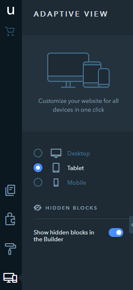
You can configure the way your website appears on different devices right in the Builder. Adaptivity settings allow you to customize the view of your website on PCs, tablets, and mobiles. These settings allow you to:
- Customize the background for each website version;
- Hide blocks and widgets unnecessary for a specific version;
- Configure the position of widgets so that they are divided into 2 columns in the tablet view;
- Configure text size and line spacing;
- Configure the product cart design.
Widget Settings
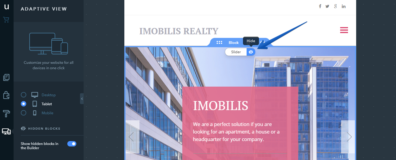
Individual widgets can only be hidden for the tablet and mobile versions of your website. You can do that by mousing over a widget and clicking on the corresponding icon while in the Builder mode for a specific website version.
Note:
It’s not possible to hide blocks on the system pages - you can only customize the block background.
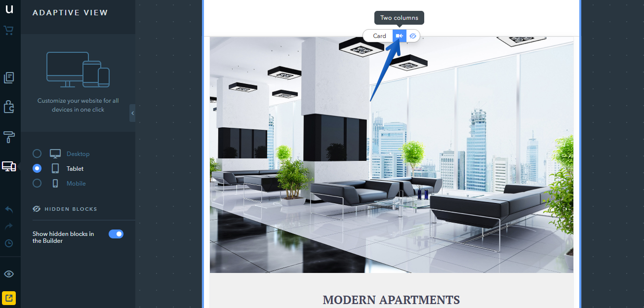
In the tablet view, you can configure the position of widgets so that there are 2 columns on a page which helps show the information in a more convenient way: click on the necessary widget and select Two columns. To go back to the original display, click on the One column button.
Note:
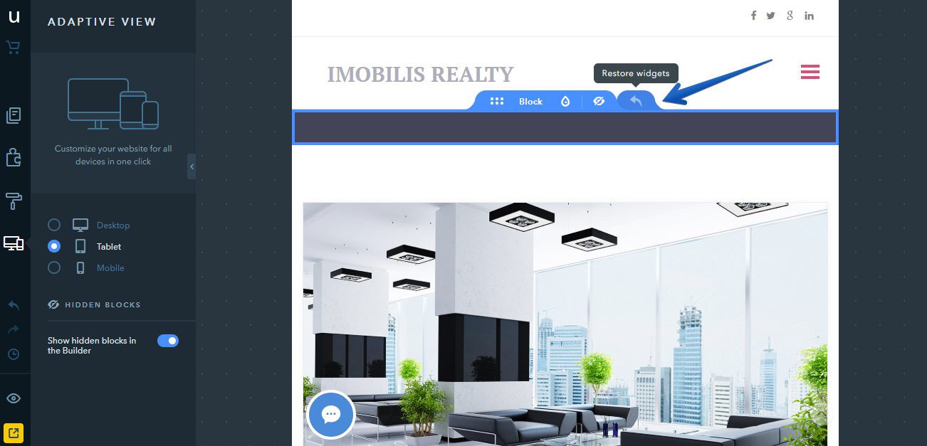
If a block has hidden widgets, there’s a Restore widgets icon that appears in the settings panel of this block - it returns all widgets to their original state. Also, it makes the hidden widgets visible again and resets the two-column view within the block back to one-column.
Note:
When editing widgets, the changes will be instantly applied to all versions of your website, not just the one which is currently selected. For example, if you change a heading in the tablet view, it will also change for the desktop and mobile views of the site.
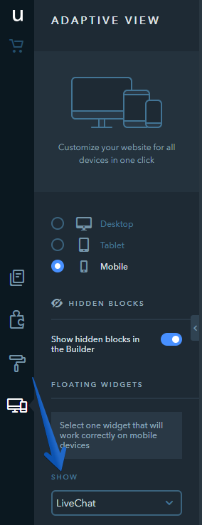
To ensure the correct and stable work of your website on mobile devices, only one floating widget can be displayed in mobile and tablet view. If you have more than one widget like this in the desktop version, you can choose between them in the settings. The other widgets will be hidden. If there’s just one floating widget on your website, this setting won’t show up for you.
To configure text size and line spacing for each device, select the necessary device, for example, a mobile, click on any part of the Text widget, go to the text settings and change the text size and line spacing with the zoom slider.

Note:
With the help of this setting the text size gets proportionately applied to the whole widget, rather than to particular words or elements selected with the mouse cursor.
For tablets and mobile devices, you can select the location of the cart. In the Adaptive site version section, select the Tablet or Mobile option, click on the "cart" icon and select the design.

You can set the space with the Space widget for mobile and tablet site versions to change the space between the elements. To do this, select the desired device type, click on the widget, and drag the bottom border line or set the value in pixels for the specific site version. The minimum value is 10px.

How Do I Hide a Block?
Any blocks, including the header and the footer, can be hidden in a selected website version. To hide a block, mouse over it and click on the Hide icon. Hidden blocks turn grey in the builder mode and the widgets they contain are not available for editing.

For example, if you hide the header on the desktop version of your website, it will be displayed in the tablet and mobile views only. To make the block visible again, click on the Show icon.
Note:
If Show hidden blocks in the Builder is disabled, hidden blocks will not be displayed.

Block Background Settings
If you update the block background (color, image, map) for the desktop view, the background will change on all website versions. If the block background is changed in the tablet or mobile view, the changes will be applied to this version only.
Thus, you can achieve faster loading for the mobile/tablet version by disabling images in the block background.

Note:
The Reset to defaults button allows you to undo all changes made to the block background on mobile/tablet versions and restore the background of the desktop view.

Widget Positioning Settings in the Mobile Version
The desktop version of the website allows you to place several widgets on one line, while in the mobile version, only one widget can be placed on the line. So a row from the desktop version turns into a column on the phone starting from the left widget in a row. And yet, sometimes, you may need to form a block with several widgets that should look like one unit and follow each other in the mobile version.
Let's take an example of a block where hotel amenities are presented as the combination of the “Icon” and “Text” widgets.

When you place widgets in the mobile version as usual, the amenities will be displayed separately — first you will see all the icons and then all the texts.

If you want the widgets to be ordered in a specific way in the mobile version, you need to “connect” them to each other in the builder. To do this, drag the widget to another widget which it should follow in the mobile version until the blue line appears under the second widget only. In this example, you should drag “Text” and put it under “Icon”.

After “connecting” all the “Text” widgets to all corresponding “Icons” in the mobile version, they will follow each other in the “Icon” + “Text” order.
